For this Design Digest project we were asked to choose 12 words to develop concepts around the words and also come up with an outcome using diverse techniques. Thinking outside of the box as well as experimenting out of our comfort zones was a big part of this creative project. Lastly, we were asked to apply each final outcome into a Graphic Design context. This project was one of the projects that I did during my final year at Marbella Design Academy.
The first word of this project is HOME. I used vector illustration as the technique and created a digital art piece that playfully suggests, for cat-lovers (or the owners of any beloved pet) that your home is where your pet(s) is/are.
The final outcome was used on a very common household object, a mug cup, as you can see in the following image.
The second word for this project is INDEPENDENCE and to express the concept behind this word, I created a three-frame comic strip.
The concept behind the word:
Sometimes, you have to ask for help from others and stop relying entirely on yourself and being overly independent can be toxic to you.
I shared this final outcome on Instagram in terms of applying to the real world.
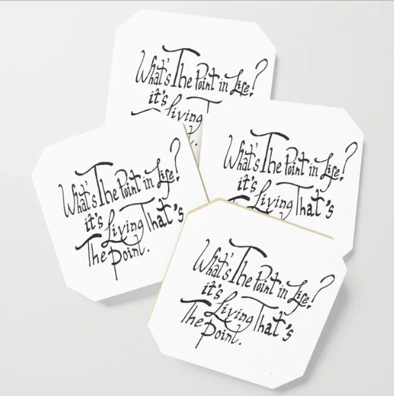
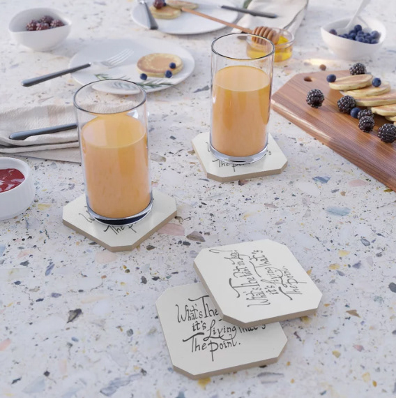
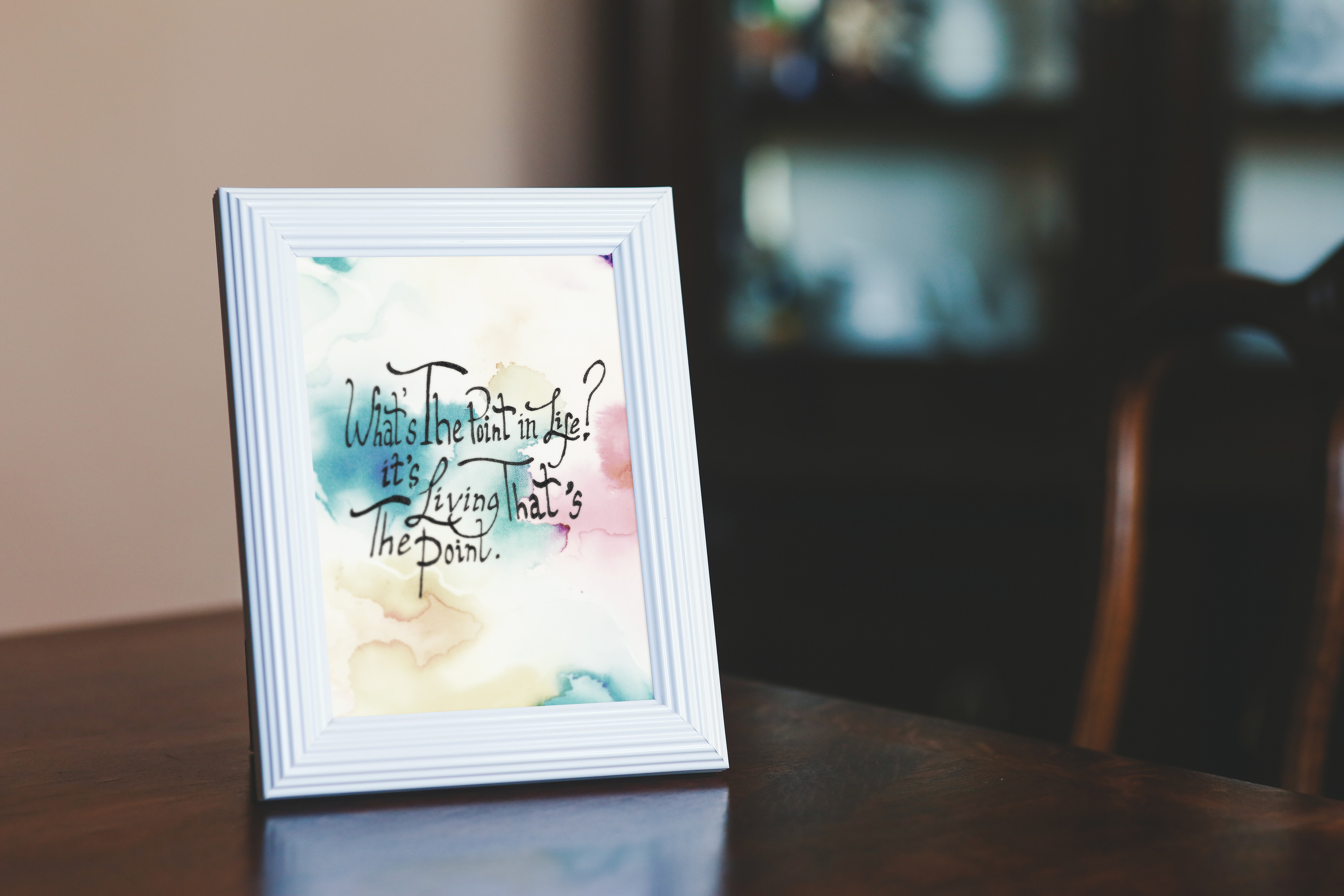
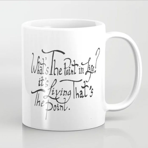
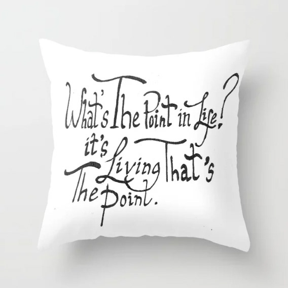
The third word for this project is LIFE. I picked up calligraphy for the first time and used it as the technique for this word.
The concept behind the word came from personal inspiration, I used to have severe depressive episodes in the past and when I would talk to my father and often contemplate the meaning of life and what makes it worth living, he would answer the following:
The final outcome can be used on various household objects to remind the user that the point of life is living, and that this is the only real point to life. It acts as a reminder for people who are vulnerable to feeling depressed that being in the present moment and being thankful for what you have can help you overcome depression.
The next word of this project is PERSONALITY.
The concept behind this word was the idea that sometimes people make judgments about others by looking at their appearance without actually getting to know them. I asked a friend of mine to tell me some things she had heard people saying about her, some personality traits she was judged to have by others that she did not agree with.
A mirror was used to represent the person's appearance and later on shattered to represent the damage and negative impact judgments like these can have and the traits I found out about my friend were written and digitally manipulated to create this art piece.
The final outcome was applied to a magazine article discussing the mentioned topic, having a physical appearance that plays against your true personality traits.
Another word I chose for this project was the word RECOVERY.
The technique used was collage and I used my personal diary entry clippings to create an art piece and it represents the healing process one goes through in order to overcome depression to become a more mentally and emotionally stable person. I used the word recovery to express recovering from a mental (or physical) illness.
The final outcome I created is meant for use as an art piece to be hung in a serene place or in a gallery for people to appreciate. It could also be displayed in a coffee shop or bookstore.
The next word is BEAUTY.
I created a video to represent beauty in South Korea where plastic surgery is extremely common and a country where media has taken such a strong hold on what it is considered to be beautiful; in this case a beautiful woman. I tried to express how such a set standard and generalized idea behind what beauty is, people will lose individuality and end up being unoriginal, sometimes looking so similar to each other that in this video, you can hardly tell a person apart.
For the word CONFLICT I decided to express the inner conflict that goes in your mind when it comes to fighting substance addiction. We know we shouldn't, and in this case of addiction to smoking, I tried to express the word through a stop motion video. I tried to express how our mind sometimes fails to fight the craving and eventually gives in to it, creating relapse which is part of the painful journey of becoming a non-smoker.
I applied this final outcome as social media content for the page dedicated to "Allen Carr's Easy way to quit smoking". The Allen Carr program had taken the world by storm and has helped thousands of people to successfully stop smoking by changing the way they view their addiction.
The next word is COURAGE.
I also talk about mental illness through this word as it has been a constant battle for me in the past to have reached my current state of stability. I try to express through this video, the courage it takes to open up about a dark period in your life and how much courage it takes to own up to mistakes you have made in the past to other people and even your therapist.
I used a shot from the video as the image for advertising BetterHelp which is an online counseling app that is gaining popularity in the current market.
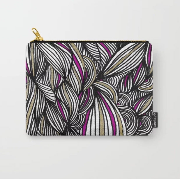
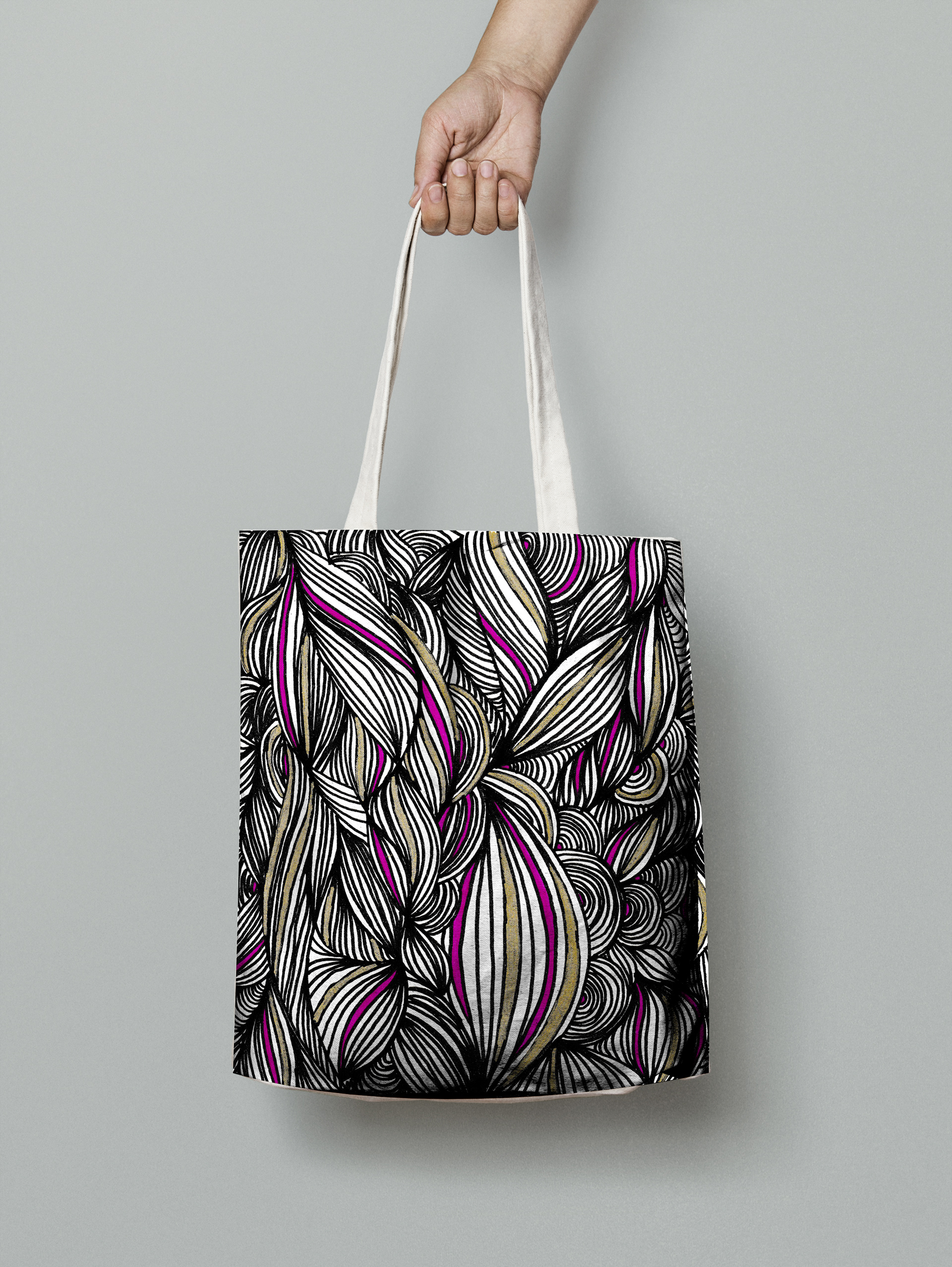
The next word is FLOW.
Flow is a state where you are able to focus immensely on the activity you are doing. Athletes, Scientists and creatives have studied "flow" for years and I tried to express my personal flow through a video.
I used the art piece I created for the word Flow on a tote bag and a pouch. I decided the artwork I had created would work well as a surface pattern.
The next word is RESPONSIBILITY.
This word introduced me to animation and I was able to learn the basics of AfterEffects working on this video. I tried to express the art of being able to detach with all of your responsibilities and worries being an important skill of modern day life.
I applied the animation to be part of a website called "verywell" which discusses physical and mental health. Below is a mockup I created of how I imagined the website to look like.
The last word for this project is STATUS.
I used the connection between having a lot of money or possessions being able to express your "status" in society. The technique I used was miniature art photography and I had a lot of fun creating this art piece. Using coins and figurines, I digitally edited the photograph so that I could apply text to the image and use it as the base for an advertisement.
I used the final outcome as the base for a billboard advertisement for Udemy, which is a website people can give lectures or learn about a new skill.
This marks the end of the final outcomes for this creatively challenging project where I was able to try out various new artistic and graphic design related techniques and learned a lot about the process of having a strong concept behind my work.